Arthmoor Posted September 7, 2010 Posted September 7, 2010 So I've got this nifty idea for the Faregyl revamp and can't find anything close enough to try and make it work. Here's the basic idea.Make a mesh that will fit the dimensions of the OblivionGateOblivionMagicgate01.NIF which is used for those animated blue portals. Something that runs along the inner arc.The basic idea is to make it possible to put a texture on it to "see" the other side.Take this:With the added mesh, it would look sort of like this:Bonus points if the mesh plane can show the same image mirrored on the back side. It would be a pretty neat general resource item too.
Dwip Posted September 8, 2010 Posted September 8, 2010 Attached to the portal, or unattached? Ought to be easy enough to do, although I suppose it depends wildly on if it would need to be animated to deal with the portal moving or not. Pretty much just create a plane, UV map it to a texture, and go.
Arthmoor Posted September 8, 2010 Author Posted September 8, 2010 Unattached. Doesn't need to be animated either. I realize it'll look slightly out of whack but I think the net effect will be cool.
Dwip Posted September 8, 2010 Posted September 8, 2010 Take me about 5 minutes, but I'll need to get home first.If you have a texture in mind, 512x512 or 512x1024 (high) or whatever, go ahead and toss it on the server for me?
Arthmoor Posted September 8, 2010 Author Posted September 8, 2010 ScreenShot635.bmp awaits on the server. I haven't resized it but you should be able to handle that
Conner Posted September 8, 2010 Posted September 8, 2010 You'll have to post a screenshot for us to see the final outcome, it does sound pretty good.
Dwip Posted September 8, 2010 Posted September 8, 2010 PortalBackground.nif and .dds on the server. No collision, the normal map is pretty rough, and I haven't tested it, but it should work moderately well.
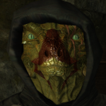
Arthmoor Posted September 9, 2010 Author Posted September 9, 2010 Behold, the portal:Dwip's normal map: http://img46.imageshack.us/img46/5202/originaleh.jpgMy adjusted normal map: http://img40.imageshack.us/img40/3711/mynormalmap.jpgI like my adjusted map better. Otherwise the trees and stuff in the image look distorted when combined with the portal's particle animations. Crappy dungeon lighting, but that's more or less where the portal will be is in a dungeon. It will probably look better when the dungeon is visible from the portal on the other side.
Hana Posted September 9, 2010 Posted September 9, 2010 Oooohs and Ahhhhs. Yeah, the adjusted normal looks smoother.
Conner Posted September 9, 2010 Posted September 9, 2010 Definitely like it, in both versions, though Dwip's seems brighter while your version seems clearer (I expect that it's an optical illusion based on the lighting elements). Which is to say I do like yours better but only slightly they both look great. Are they supposed to extend beyond the portal frame itself? (Or beyond the arch they're otherwise framed by anyway because they both appear to do so.)
Arthmoor Posted September 9, 2010 Author Posted September 9, 2010 It would probably look better over all with a portal that wasn't broken up the way this one is. The way it bounces around is kinda lame, but hey. We work with what we have. Unless someone is feeling particularly generous and wants to make a version of that portal where the arch isn't animated and not broken up.
Dwip Posted September 9, 2010 Posted September 9, 2010 Yeah, your normal map is better, I think.The visible edges thing is kind of shit, but I don't know that I see a good way around that. Due to the complexity of the portal, there's zero chance of making it non-animated/non-broken up. Just can't happen.It might be possible to do something around the edges where you make the texture gradually more transparent, which would hopefully tone down the edge cutoff a bit, but hard to say. Easy enough to do it if you want it....ah, I see we're being censored. Huh.
Conner Posted September 9, 2010 Posted September 9, 2010 I see, the static images I was looking at (your posted screen shots) don't show the animation. :shrug:Keep it clean, Dwip!
Arthmoor Posted September 9, 2010 Author Posted September 9, 2010 A transparent fade effect would work for me. I tried hacking out the animated portions of the gate but couldn't make much sense of the stuff in nifskope so decided to just not try :)Also, no more censor.
Conner Posted September 9, 2010 Posted September 9, 2010 But, if you get rid of the censor who will conduct our census?
Dwip Posted September 9, 2010 Posted September 9, 2010 @Conner - cute.@Samson - New texture on the server, slightly different name than the last. You'll probably need to add a NiAlphaProperty block to the nif in order for it to work right. May or may not need a new normal map, too. See what you think.
Arthmoor Posted September 11, 2010 Author Posted September 11, 2010 http://img529.imageshack.us/img529/6915/screenshot656i.jpgCould do with a more gradual fade to the edge. Also, the middle part is suffering from alpha bleed over something awful. That shouldn't have been transparent at all.
Conner Posted September 11, 2010 Posted September 11, 2010 So, this is still not what you're trying to achieve then? I think this version looks better, but I'm not certain that I'm clear on what we're shooting for either at this point.
Dwip Posted September 11, 2010 Posted September 11, 2010 You appear to be correct. *sigh* Gradual fade is pretty hard. I'll see if I can't keep poking at it.Also, the alpha bleed in the middle was on purpose, in an attempt to make it a little more interesting. I take it that part doesn't go so well?
Arthmoor Posted September 11, 2010 Author Posted September 11, 2010 No, unfortunately it doesn't. I can see what you were after, but it just plays out all weird and the portal's lights act like an electrical arc or something which is highly annoying.It does definitely look better than before, at least at the edges. I still don't know how it will play in an open area with proper light. Speaking of which I will probably need to know how you're doing this since I can't see me bugging you for a bunch of these things down the road if I decide to use them elsewhere
Dwip Posted September 11, 2010 Posted September 11, 2010 Short version, assuming GIMP:1. Make a 512x512 image. Give it an alpha channel.2. I've stuck a TGA on the server that has the outline of the mesh. You'll want to convert the white part to transparency, then paste it as a new layer in your main image.3. You'll want to select everything outside the outline, then delete it. Fuzzy select the area with the outline layer selected, then switch to the main image layer and delete.4. I've been doing the fading using an eraser brush and changing the opacity setting to something less than 100. I was pondering attempting Filters/Decor/Fuzzy Border, too, but didn't actually get that far.


Recommended Posts
Create an account or sign in to comment
You need to be a member in order to leave a comment
Create an account
Sign up for a new account in our community. It's easy!
Register a new accountSign in
Already have an account? Sign in here.
Sign In Now